Redmond Distributing’s website hits the streets
the challenge
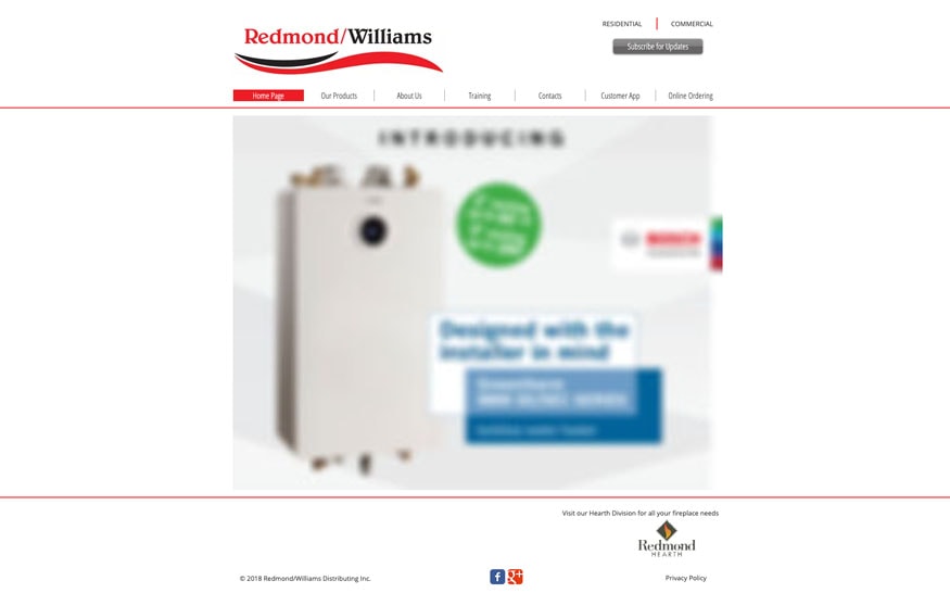
For over 20 years, family-owned and operated Redmond Distributing has been supplying HVAC products and fireplaces across Canada. The company also offers training for HVAC technicians to help improve their skills but struggled to promote this service. Redmond’s old website was heavily product focused and difficult to maintain as information about the HVAC products had to be constantly updated for legal reasons.
Redmond was going through a major change with Melissa taking over the reins of the business from her father, Chris. Melissa wanted to refresh Redmond’s image and position the company as modern and exciting so she enlisted the help of Candybox Marketing for a digital facelift.


our process
Step 1
When it came to branding, there was a delicate balance between refreshing Redmond’s brand and erasing history. By working with Redmond as partners throughout the whole process, Candybox was able to modernize their identity while still paying homage to their history.
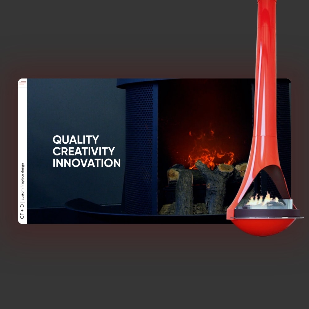
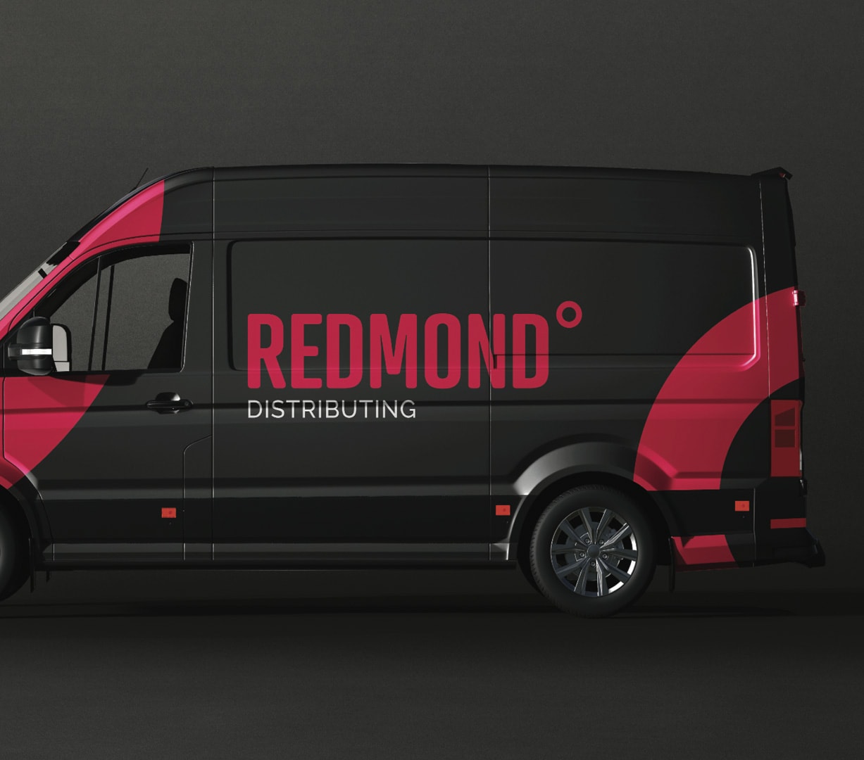
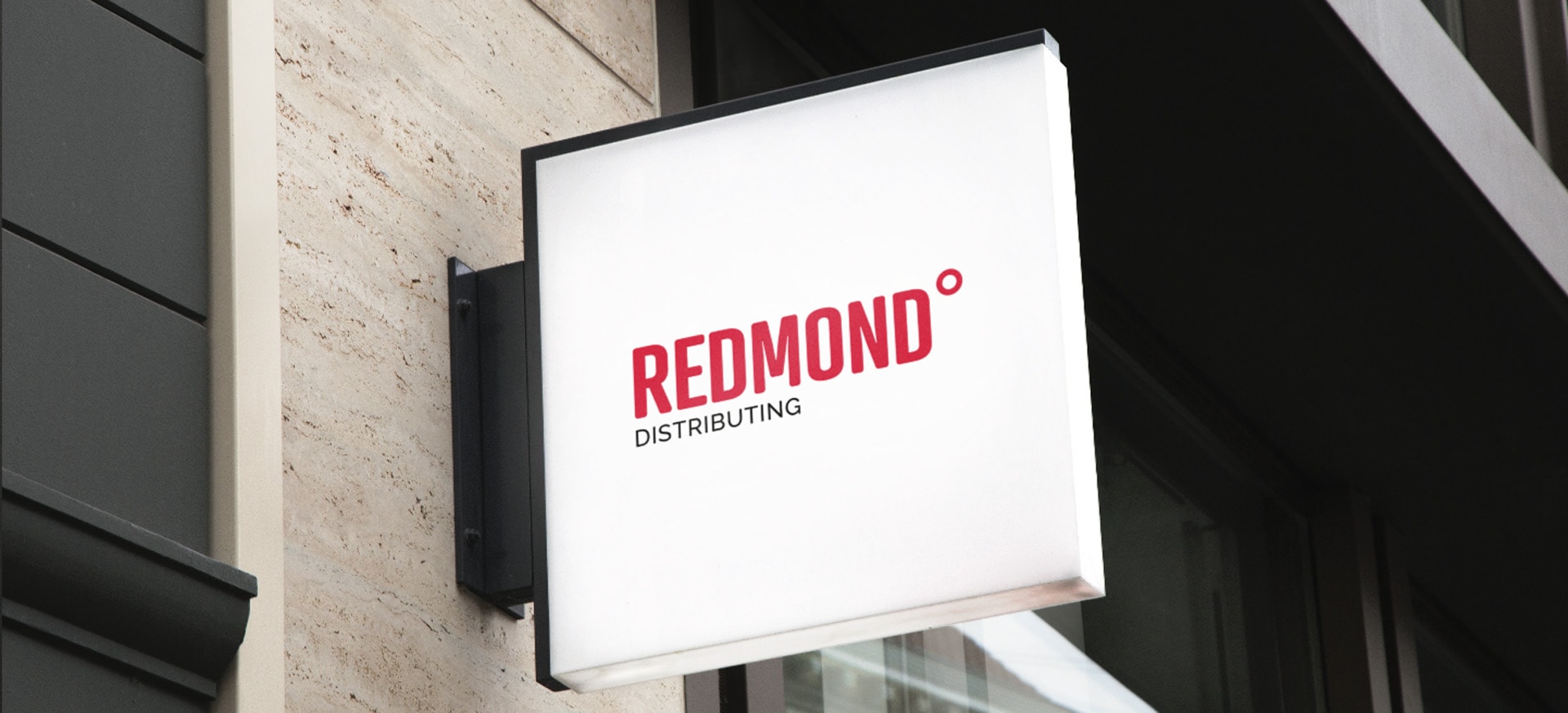
We knew that the colour, red was perfect for Redmond. While red symbolized their heating solutions, it was also bright, bold, and modern. We opted for a clean, rounded font for the company’s logo and incorporated a degree symbol as a nod to their heating and cooling products. Something as simple as a circle can have so much meaning which is why we extended the shape to all aspects of the brand.
Step 2
After the visual components of Redmond’s brand identity had been established, we focused on the company’s positioning. While Redmond was an HVAC distributor, they also offered fireplaces. In order to emphasize both products, Candybox recommended that Redmond reposition themselves as Redmond Distributing, a parent company with subsidiaries in HVAC and fireplaces.
The other part of their identity Redmond wanted to emphasize was their family values. Candybox was able to showcase the Redmond family’s relationship through a series of heartfelt videos. We gathered the family together, had them sit on a couch and share stories about each other. By capturing those genuine moments, we were able to create authentic videos that resonated with customers and position Redmond as a truly family oriented company.

Step 3
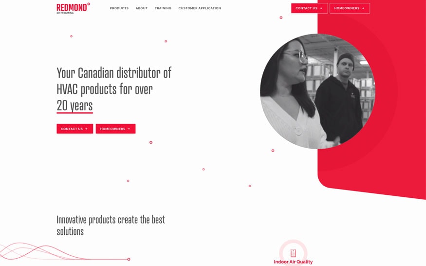
Redmond’s new custom website is a perfect representation of their updated brand. Using the brand colours of red and white, Candybox created a simple yet captivating design that reflected Redmond’s identity. We incorporated circles and rounded elements throughout the site for consistency.
Candybox not only improved the visual design of Redmond’s website, we also focused on the information and user experience. Redmond’s previous website was full of technical information about their various HVAC products. This made the website difficult to maintain as the information had to be constantly updated. It was also difficult for customers to navigate through the pages.
In the updated website, Candybox restructured Redmond’s information architecture to focus on products and training. Instead of catologing their entire product offering online, we chose to focus on 6 key categories: heating, cooling, water heating, indoor air quality, hearth, and commercial. Each category page contained concise information about the products and brands offered. We encouraged customers to contact Redmond to learn more about their products and promoted Redmond’s training within each category to make the website more service oriented.

the solution
Redmond Distributing trusted Candybox Marketing to help transition their brand to the next generation. By being invested in Redmond’s success and collaborating through the entire process, Candybox acted as a partner, not just an agency. We were able to modernize Redmond while staying true to their roots and position them as a truly family oriented company with quality products.
merging branding with website design.
proven results


I put something that is so precious, so important, so special to us in your hands and I feel like it’s being taken care of.